Analytics
Your performance broken down: the net equity curve, headline metrics, how you trade, risk and drawdown, execution quality, and the full trade history, for one account or all of them.
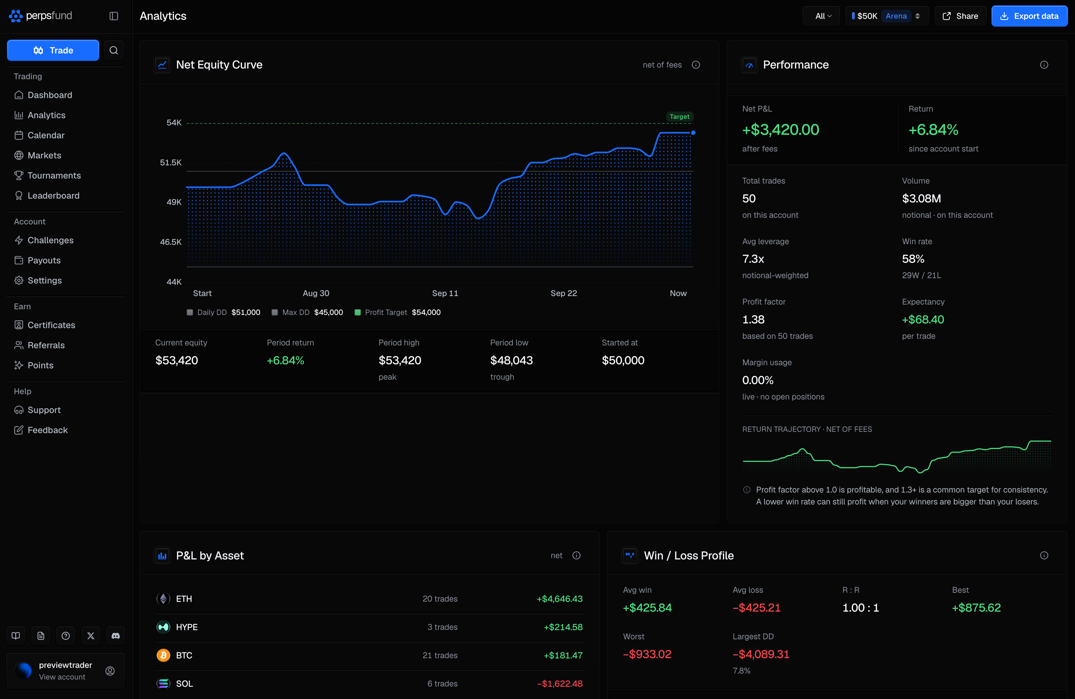
Analytics turns your closed trades into a performance breakdown: your equity over time, your headline numbers, how you trade cut different ways, your risk and drawdown, how well your orders filled, and every closed trade in one table. Pick one account, or All accounts to see them side by side. Opened from the analytics button (Open analytics) on the Dashboard's Perps Score panel, the page starts on that account.
Every figure prints from your first closed trade. While the sample is small, a figure carries a short note saying so, so an early number is never passed off as a settled one. See Small samples.
The header
On a computer the header is a bar across the top of the page and stays in place as you scroll, so these controls are always in reach.
| Control | What it does |
|---|---|
| Period menu | Scopes the page to 24H, 7D, 30D or All. Hidden while All accounts is selected. |
| Account switcher | Picks the account, or All accounts ("Combined across accounts"). It has the same tabs and Archive controls as the Dashboard switcher. |
| Share | Opens the performance card for the selected account and period. Disabled for All accounts and when the period has no closed trades. See PnL cards. |
| Export data | Downloads the trades in the current period as a CSV file: date (UTC), market, side, size, entry, exit, fee, realized P&L and net P&L. Disabled when the period has no closed trades. |
The time range
The period menu scopes the page to a window, so the charts and figures below describe the same trades.
| Range | Scope |
|---|---|
| 24H / 7D / 30D | Trades closed in the last day, week, or 30 days. |
| All | Your full trade history on the account. This is where the page starts. |
One figure does not follow the menu: Margin usage, which is a live reading of your open positions right now.
The equity curve
Net Equity Curve plots the account's equity over the period, net of fees, ending at your live equity. It is the same curve as the Dashboard's: a point every hour on 24H, every 2 hours on 7D (from a reading taken every 15 minutes), and every day at 00:00 UTC on 30D and All. Each point is your equity at that moment, never an average. An account younger than the period draws from the moment it opened, across the full width; until there are 7 days of 15-minute readings (they began on 24 September 2026), 7D draws the ones that exist, full width too.
The dollar axis is the Dashboard's, on a phone too: four or five evenly spaced labels. On an account in evaluation the top label is the profit target exactly and the labels step down from it by 1, 2, 2.5 or 5 of a power of ten until they reach below your equity and both loss floors (how the steps are chosen). A funded account, or one with no target, keeps round steps that take in both loss floors and your equity over the period, with a little room above and below, never spanning less than 1% of the starting balance.
A very faint grey dotted line runs across the chart at every label (there were no gridlines until 26 September 2026). The line is blue from end to end, as on the Dashboard, over a halftone of small blue dots (brighter since 29 September 2026) that fills the chart down to its floor, strongest in the upper half and fading out near the bottom. A dot marks your equity now. The floors and the target are always on the chart as thin lines: the floors solid, the target a dimmer, dashed green (solid and brighter until 29 September 2026). The target carries a green Target badge just above it at the chart's right-hand edge, which moves left of your latest point rather than cover it; no other line is labelled on the chart. A legend under the dates names each with its value: Daily DD and Max DD as dim grey lines, and on an account in evaluation Profit Target in the same dimmer green, the one green line on the chart. Until 26 September 2026 the equity line here was green too, the same colour as the target. A limit the account does not have is not drawn or listed. Once an account in evaluation passes, a dot marks where the curve first crossed the target. How the floors are measured is in Equity-based limits.
Point at the chart to read it: a dotted line follows the pointer, a dot sits on the curve, and a small box just above the dot shows the time and your equity at that point, while the part of the chart to its right dims. Near the top of the chart the box sits below the dot instead, and near either side it moves in so it stays inside the chart; it never covers the dot. On a phone, press and hold the chart for a moment to show it, drag along the chart to move it, and lift your finger to hide it; a quick tap or a scroll does nothing.
The dates under the chart never overlap. When they would, fewer are shown, down to the first and Now; on a phone the 7D range, whose dates include the hour, usually shows just those two.
Under the chart: Current equity, Period return, Period high, Period low and Started at, all read from the curve's own points, as are the max drawdown and the underwater chart further down.
Performance metrics
The Performance panel leads with Net P&L (after fees) and Return (since the account started on All, otherwise on the equity at the start of the period), then the metrics below, two to a row (one to a row when the window is narrow, so no line under a figure wraps):
| Metric | What it shows |
|---|---|
| Total trades | Closed trades in the period. |
| Volume | Their total notional value. |
| Avg leverage | Leverage across those trades, weighted by notional size. |
| Win rate | The share of trades that closed in profit after fees. A trade that closed exactly flat counts in the total but is neither a win nor a loss. |
| Profit factor | Gross profit divided by gross loss. Above 1.0 means winners outweigh losers. With no losing trade yet, it shows your gross profit instead, marked "no losses yet". |
| Expectancy | The average result per trade, after fees. |
| Margin usage | Live: the margin your open positions use now, as a share of your equity, with the dollar amount in use. |
A Return trajectory sparkline sits at the foot of the panel.
How you trade
Breakdowns that cut your trades different ways, so you can see where results come from.
| Panel | What it shows |
|---|---|
| P&L by Asset | Net result and trade count per market. |
| Win / Loss Profile | Avg win, Avg loss, R : R (average win to average loss), Best, Worst and Largest DD, with a bar pairing the average loss against the average win and your win / loss split. Avg win shows a dash until you have a winning trade and Avg loss until you have a losing one, since there is nothing to average yet. R : R shows a dash until you have both. |
| Direction & Streaks | Long P&L and Short P&L with their trade counts, Current streak, Longest win and Longest loss, your long/short split, and your recent form as a row of win and loss marks. A trade that closed exactly flat is neither a win nor a loss: it ends a streak, and it shows as a grey mark in your recent form. |
| P&L by Day of Week | Net result for each weekday, as a bar chart. |
| Trade Duration | Avg hold, Avg win hold and Avg loss hold. Hold times are recorded going forward, so older trades may not count here. A trade that closed exactly flat counts in Avg hold only. |
Risk-adjusted and drawdown
The quality-of-returns view: not only how much you made, but how smoothly.
| Panel | What it shows |
|---|---|
| Risk-Adjusted | The Sharpe ratio (return per unit of total volatility, annualized), Sortino (the same against downside swings only), and a ratio of return to maximum drawdown, all from net daily returns. A day's return is its net result divided by your equity at the start of that day (00:00 UTC). They need at least 2 trading days with closed trades in the period; until then the panel says how many you have. |
| Underwater | How far below your equity peak you have been over time, with the deepest drop in the panel head. |
| Daily P&L | A bar chart of your net result for each trading day, green up and red down. The day-by-day calendar is the Calendar page. |
| After-Cost Performance | Net P&L (after fees), Realized (gross) (before fees) and Fees paid, with a bar showing how much of your gross profit went to fees. |
Execution quality
How your orders actually filled, compared with the price you intended.
| Panel | What it shows |
|---|---|
| Slippage | Avg slippage, Median and % adverse, as a percentage of position size so trades of different sizes compare fairly. Adverse fills show as negative. |
| Slippage by Size and Asset | The same, broken out by trade-size band and by market, with the number of trades behind each row. It appears once at least one trade has captured slippage. |
Slippage is recorded going forward, so trades without it show a dash and do not count here.
Trade history
Trade History is every closed trade in the period, with the count beside the title. Columns: Market, with a badge beside it for the side and the leverage the position had when it closed (for example 5x Long; there is no separate Side column), Size (notional), Entry, Exit, Slippage, Fees, Net P&L, Closed, and a share icon that opens the trade card. Every heading but Slippage sorts: click once to sort (A to Z for Market, biggest or newest first for the others), again to reverse it, and a third time to clear it, back to newest first. Long histories page with Prev and Next. This is the full per-trade list; the Dashboard shows only the latest trades.
On a phone each trade is two lines: the market and its badge on the first, the close date, the notional size and the slippage on the second, with the Net P&L at the right of both.
Small samples
Nothing on the page waits for a minimum number of trades. Only the risk ratios wait, for trading days rather than trades. Instead, a thin sample is labelled where the number is:
| Figure | The note it carries |
|---|---|
| Win rate | Your wins and losses, then "firms up at ~20", until you have that many trades. |
| Profit factor, Expectancy | Your trade count, then "firms up at ~30". |
| Sharpe ratio | Your trading-day count, then "firms up at ~10". |
| P&L by Day of Week | "firms up at ~5 a day", until each weekday you trade has that many trades. |
| Slippage | The captured-trade count, then "firms up at ~8". |
While the sample is small, the explanatory note under the Performance and Win / Loss Profile panels reads "Building confidence - these reads firm up with a larger sample of trades." instead of its usual guidance.
A fresh account starts empty
Before you hold an account there is nothing to analyze, so the page shows a short empty state, "No analytics yet", with a Get Funded button. Once you hold an account the full page is there: until your first closed trade each panel says what it is waiting for, and that trade fills it in.
All accounts
With All accounts selected, the page combines the trades of every account you hold, archived ones included, over their full history. Some figures cannot be pooled honestly, because each is measured against one account's own balance, so the page shows them per account instead:
- The equity curve becomes Per-Account Performance: net P&L, return and max drawdown for each account.
- Return, Largest DD, Margin usage, the risk ratios and the underwater curve read "per account" or ask you to select a single account.
- The period menu is hidden and Share is disabled.
On a phone
On a phone, Analytics is Analysis in the bottom bar. It shows one account at a time, with the account chip, the period menu and a share button in the header. The sections are the equity curve, the Perps Score, Performance, Risk-Adjusted, Win / Loss Profile, Direction & Streaks, After-Cost, P&L by Asset, Daily P&L and Trade History, with an Export CSV button under the trade list. Underwater, P&L by Day of Week, Trade Duration and the two Slippage panels are on the desktop page only; each phone trade row still shows its own slippage. The combined All accounts view is on the desktop page only; on a phone it offers to open a single account instead.
Directly under the equity curve, the phone shows the Perps Score for the account you have selected: the same radar with each axis's score in a grey badge, and Score: over its bar with the band in a grey badge, exactly as the Dashboard shows it on a computer. It has no analytics button, since you are already there. Like the Dashboard's, it is not shown for a breached, passed or finished tournament account, and before your first closed trade the radar is empty. The phone Dashboard does not show it.
Related
- The Dashboard - your live account state and cushion, per account.
- Calendar - your closed trades as a month of days.
- PnL cards - sharing your performance or a single trade.
- The Rules - how equity and the loss floors are measured.